
As a freelancer, I have worked on designing and implementing a new IPTV middleware (digital TV) for PW. Armed with my previous experience, I wanted to create a system that incorporates everything I’ve learned about designing for the platform.
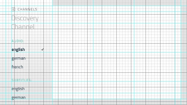
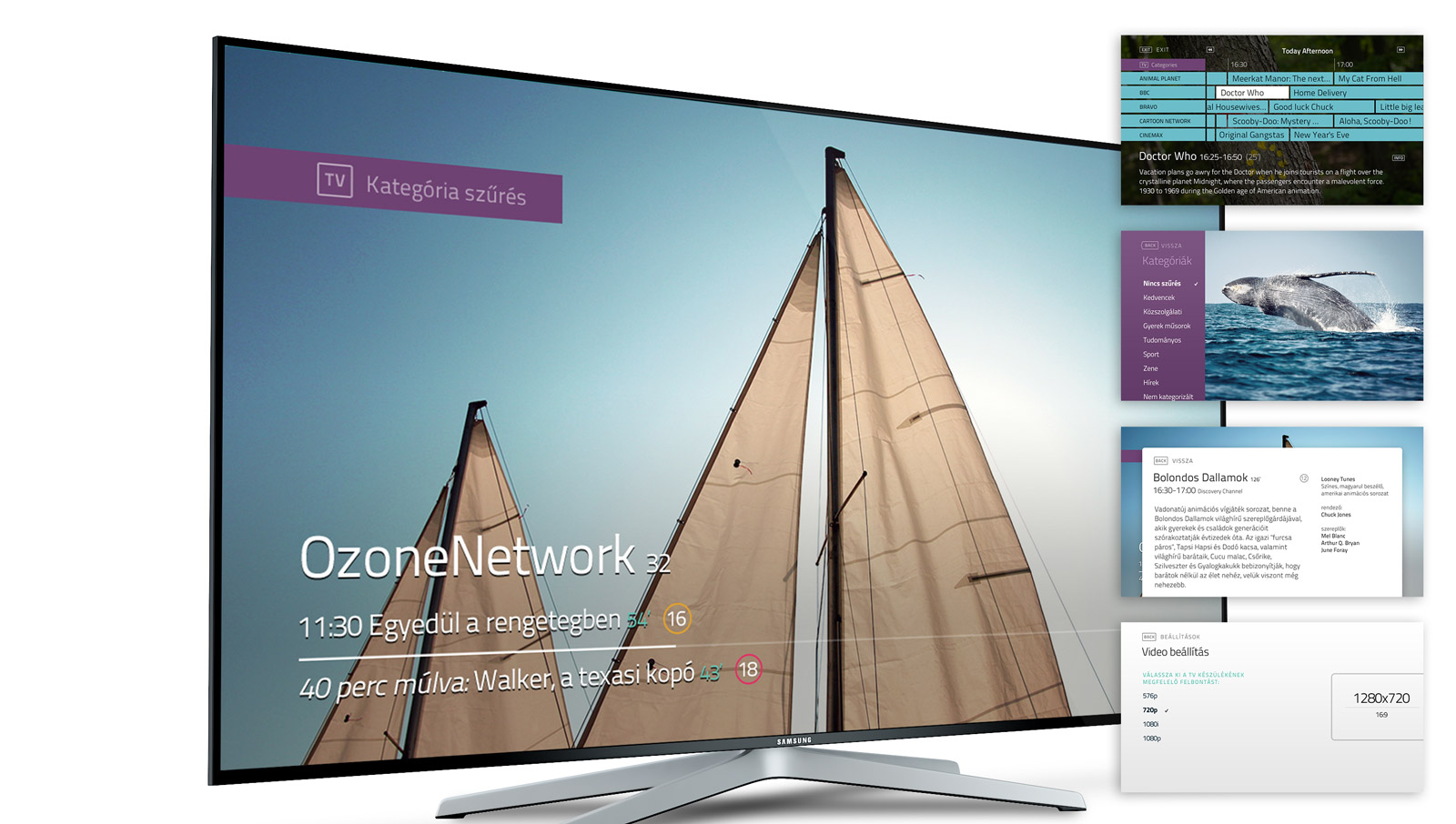
Starting with the basics, I have devised a strict grid that takes into account the different TV screens sizes and safe areas. Next I needed a typeface that is legible in smaller sizes, on black-on-white or white-on-black, and could provide some personality for the UI. My aim was to keep the design clean and minimal, so I looked at the typeface to provide branding.
Based on past experience, the most important UX considerations were:
- keep the navigation consistent
- don’t use color buttons
- animate transitions, so users understand their actions
- minimize ‘hidden’ features
- avoid text input at all costs
- don’t block the content (eg. with menus)
We had features like EPG, VoD or parental lock, paired with a very generic TV remote. Simple navigation for all this functionality required planning. There were a few cornerstones: we had to use the arrow buttons, and whatever else we could from the generic ones as well (menu, exit, tv, …). Starting from the basics, through a few iterations I have mapped out the actions in a way that is consistent, and expandable.
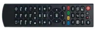
The obvious ones:
- CH +/-, Vol +/-, Numbers
- Menu, Exit, Back
- EPG, Fav (Add to favorites)
- Mute, Settings
- Record, Play, …
The not so obvious ones:
- App (We had no app.. The whole UI was an app…)
- TV (A TV button – on a TV remote…)
- Music symbol (Audio language, probably? Or will it play a song?)
- Info (About, what?)
- Aspect ratio (We had three buttons potentially indicating ‘screen size’ or ‘aspect ratio’)
A few quick tests among ourselves showed that these are quite ambiguous, and some of us said they wouldn’t even try to use these keys, in fear of doing something wrong. So I ended up using them as shortcuts, while also providing access the functionality from the menus. In addition, all the important button shortcuts are displayed on-screen.


One issue we have found during user testing was navigating a large number of channels. A key-repeat speed limitation of the set-top-box we were using meant that scrolling through lists just wasn’t quick enough.
The solution was to group the channels by subject, and make it very easy to filter by these categories. I had to find a dedicated button for quick selection, and eventually picked the still unused ‘TV’ button. (This is the problem with generic remotes, but sadly we had no choice. My argument was, these are categories for TV channels…) Next I made sure to display the category selection and associated button on all relevant screens. I have also assigned a custom purple color to this feature, so that users could make a visual connection.

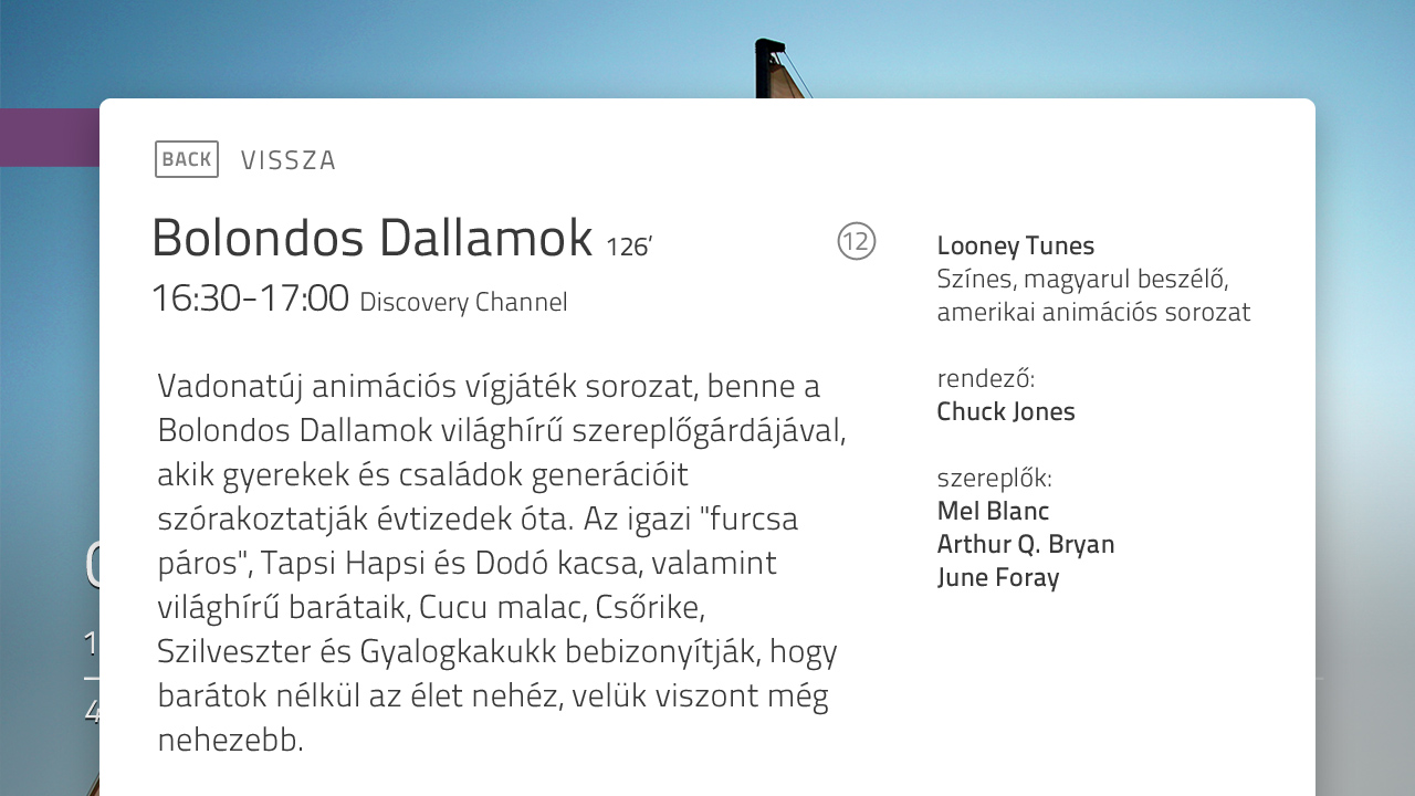
As the primary goal is watching television, I wanted to keep the UI as transparent and minimal as possible.
The main menu is just a few lines of text on the screen. The program guide is semi-transparent, and the channel list and audio selection menus stick to the side. Exceptions to the rule are the settings screens, for these require more attention. The screens are free of embellishments or unnecessary borders: the content itself is the UI.
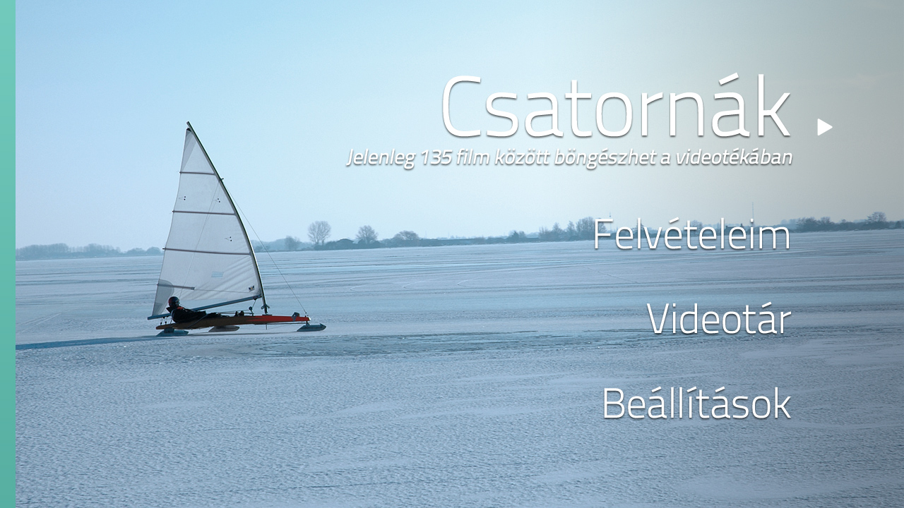


All text is sized so that it’s comfortable to read — even from a distance, or on a smaller screen. White spaces are generous, and the position of all the repeating elements are consistent.
Panels transition in from outside of the screen, hinting at where they belong. Channel information, audio and subtitle settings sit on the left, program information is at the bottom, and the main menu appears from the right side. This way the basic functions are visually grouped together.
Emotional design
I have carefully avoided the use of the meaningless color buttons throughout the UI. Still, I thought some folks might press these at one point, either by accident or curiosity. Then the idea hit me: why not give these a more straightforward meaning: colors. I have created 4 color schemes for the UI, and hooked them up to the red, green, yellow and blue buttons.
Overall, our efforts proved to be successful. The company has received positive feedback from users, and also: much fewer support requests.
I have written a Medium post about my adventures:
Creating better TV interfaces